Idea
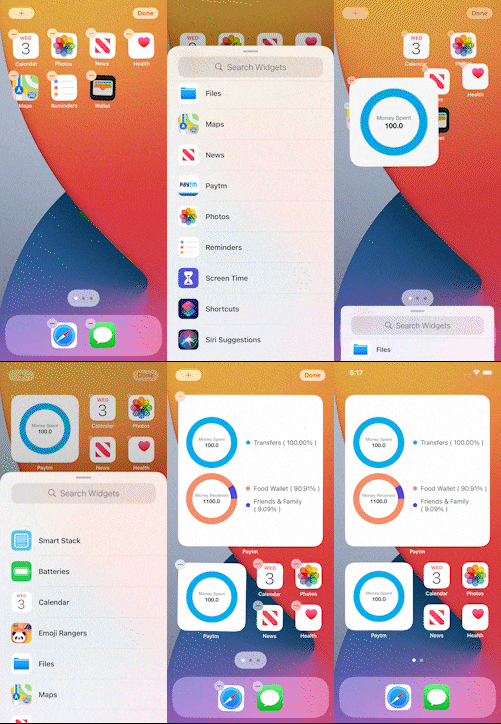
Paytm Analytics is a wizard that is envisioned with the thought of creating a visual feed of how your expenses summary looks like. For a user, it’s really important to know how much has he/she spent and earned during the month to keep track of expenses. The challenge for us is to present more information since our viewable size is too small, that’s why we took the help of different variant sizes i.e. available in iOS widgets.
Explanation and Code Boilerplate –
In order to create the widget, we had to start with the TimelineProvider implementation.
TimelineProvider is a type that advises WidgetKit when to update a widget’s display.
WidgetKit requests a /timeline/ from the provider. A timeline is an array of objects conforming to TimelineEntry. Each timeline entry has a date, and you can specify additional properties for displaying the widget.
For example, consider a widget that displays the number of kilometers run by the user then it needs to refresh the timeline after a few seconds
Widget kit ask for timeline entries in one of two ways –
- A single immediate snapshot, representing the current widget state.
- An array of entries, including the current moment and, if know, any future dates when the widget state
In our scenario, we will be providing these details by fetching the data from API that will provide the cumulative details of expenses made by the user and those needs to be updated in the timeline so that required calls can be made after a particular interval of time to update the expenses details. Inside timeline provider implementation we’ll also present the placeholder data that will act as the default piece of information until we get the callback from remote APIs.
| struct Provider: TimelineProvider { func placeholder(in context: Context) -> SimpleEntry { SimpleEntry(date: Date(), spentAnalyticsResponse: spentAnalyticsSampleData, receivedAnalyticsResponse: receiveAnalyticsSampleData, spentSum: “1200”, receivedSum: “5000”) } func getSnapshot(in context: Context, completion: @escaping (SimpleEntry) -> ()) { let entry = SimpleEntry(date: Date(), spentAnalyticsResponse: spentAnalyticsSampleData, receivedAnalyticsResponse: receiveAnalyticsSampleData, spentSum: “23400”, receivedSum: “5000”) completion(entry) } func getTimeline(in context: Context, completion: @escaping (Timeline<Entry>) -> ()) { var entries: [SimpleEntry] = [] fetchSpentAnalyticsData { (spentResponse) in var spentMoneyChartDataModels = [ChartCellModel]() let spentInitialFiveResponse = Array(spentResponse.coupledResponse?.prefix(5) ?? []) for dist in spentInitialFiveResponse { let spendCategory = dist.dist?.getCategory() let model = ChartCellModel.init(color: Color(spendCategory!.categoryColor), value: CGFloat(dist.dist?.getPercentage(from: spentResponse.sumtTotal) ?? 0), name: (spendCategory?.rawValue ?? “”)) spentMoneyChartDataModels.append(model) } fetchReceivedAnalyticsData { (response) in var receivedMoneyChartDataModels = [ChartCellModel]() let receivedInitialFive = Array(response.coupledResponseMoneyReceived?.prefix(5) ?? []) for dist in receivedInitialFive { let spendCategory = dist.dist?.getCategory() let model = ChartCellModel.init(color: Color(spendCategory!.categoryColor), value: CGFloat(dist.dist?.getPercentage(from: response.sumtTotal) ?? 0), name: (spendCategory?.rawValue ?? “”)) receivedMoneyChartDataModels.append(model) } let entry = SimpleEntry(date: Date.init(), spentAnalyticsResponse: spentMoneyChartDataModels, receivedAnalyticsResponse: receivedMoneyChartDataModels, spentSum: spentResponse.sumtTotal.description, receivedSum: response.sumtTotal.description) entries.append(entry) let refreshTimeAt = Date.init().dayAfter let timeline = Timeline(entries: entries, policy: .after(refreshTimeAt)) completion(timeline) } } } } |
That’s the part where we have covered the data source part of our application.
Now let’s move to UI implementation of Widget View which is responsible for showing the glanceable and relevant content from your app right on the iOS Home screen or in Notification Center on macOS
There are three key components to a widget:
- A configuration that determines whether the widget is configurable, identifies the widget, and defines the SwiftUI views that show the widget’s content.
- A timeline provider that drives the process of updating the widget’s view over time.
- SwiftUI views used by WidgetKit to display the widget.
As we have already discussed about the timeline provider, we need to create a view that shows us the piece of information and Widgets can support one or more sizes, giving users the flexibility to configure their widgets however they like. Each widget size provides a different amount of space for detail, so consider which sizes work best for the type of information the widget displays. In this example we will be support all size types –
| struct JarvisWidgetEntryView : View { var entry: Provider.Entry @Environment(\.widgetFamily) var family @ViewBuilder var body: some View { switch family { case .systemSmall: Link(destination: URL(string: “paytmmp://passbook?featuretype=spend_analytics”)!) { HStack { DonutChart(totalSumText: “Money Spent”, totalSum: entry.spentSum, dataModel: ChartDataModel.init(dataModel: entry.spentAnalyticsResponse!), onTap: { dataModel in // Do nothing as the tap won’t work. }) .frame(width: 120, height: 120, alignment: .leading) .padding(.horizontal, 12) } } case .systemMedium: Link(destination: URL(string: “paytmmp://passbook?featuretype=spend_analytics”)!) { HStack { DonutChart(totalSumText: “Money Spent”, totalSum: entry.spentSum, dataModel: ChartDataModel.init(dataModel: entry.spentAnalyticsResponse!), onTap: { dataModel in // Do nothing as the tap won’t work. }) .frame(width: 120, height: 120, alignment: .leading) .padding(.horizontal, 12) VStack(alignment: .leading, spacing: 12) { ForEach(entry.spentAnalyticsResponse!) { dataSet in HStack { Circle().foregroundColor(dataSet.color).frame(width: 10, height: 10, alignment: .leading) Text(“\(dataSet.name ) ( \(String(format: “%.2f”, dataSet.value))% )”).font(.footnote) } } } } } case .systemLarge: Link(destination: URL(string: “paytmmp://passbook?featuretype=spend_analytics”)!) { VStack(alignment: .leading) { HStack { DonutChart(totalSumText: “Money Spent”, totalSum: entry.spentSum, dataModel: ChartDataModel.init(dataModel: entry.spentAnalyticsResponse!), onTap: { dataModel in // Do nothing as the tap won’t work. }) .frame(width: 120, height: 120, alignment: .leading) .padding(.horizontal, 12) VStack(alignment: .leading, spacing: 12) { ForEach(entry.spentAnalyticsResponse!) { dataSet in HStack { Circle().foregroundColor(dataSet.color).frame(width: 10, height: 10, alignment: .leading) Text(“\(dataSet.name ) ( \(String(format: “%.2f”, dataSet.value))% )”).font(.footnote) } } } } HStack { DonutChart(totalSumText: “Money Received”, totalSum: entry.receivedSum, dataModel: ChartDataModel.init(dataModel: entry.receivedAnalyticsResponse!), onTap: { dataModel in // Do nothing as the tap won’t work. }) .frame(width: 120, height: 120, alignment: .leading) .padding(.horizontal, 12) VStack(alignment: .leading, spacing: 12) { ForEach(entry.receivedAnalyticsResponse!) { dataSet in HStack { Circle().foregroundColor(dataSet.color).frame(width: 10, height: 10, alignment: .leading) Text(“\(dataSet.name ) ( \(String(format: “%.2f”, dataSet.value))% )”).font(.footnote) } } } } } } } } } |
Here we have used a few of the custom classes that are responsible for providing the pie and donut chart view, family instance variable is used to identify the variant size alternate view that needs to be updated and entry is fetching the information from timeline entry only.
Finally the complete widget implementation will look like this –


